I’ve always said service design was a visual discipline. When the industry exploded, with the ‘design’ part in it, it was a whole visual and visceral adage to traditional disciplines like service management, business development, business management approaches (oh, and that teeny part about actually focusing on service value, needs and outcomes)
Bring us to 2022, and AI image generators using natural language are becoming more accessible through tools such as Open AI’s Dall-E, Midjourney, Craiyon, Fermat’s Stable Diffusion (there’s a whole host out there with different specialisms).
This blog is a series of my early open experimentations to see how I could use AI image generators in my service design work. It’s raw basic work, but might inspire you with some ideas on how you can use it.
Use case 1: Storyboarding
I’ve always said that storyboards are useful for articulating both as-is journeys (when you can’t film/take photos) of a user experience and for future state service concepts/journeys of someone using a service. I use storyboarding as away to help teams start to articulate service outcomes for users, organisations and the early seeds of how we might solve these.
Many people, for understandable reasons feel nervous to draw and sketch so there’s a good opportunity for bringing AI generated images into articulating user journeys.
Let’s break this down into some simple storyboarding narrative of Before, during and after narrative of a service arc.
I like this simple structure and starting in the ‘during’ stage as it helps us to focus around both the value being delivered to the user and the service outcomes for the organisation and user. I’m being really simplistic here, I recognise many services are not linear or can be simplified to this but for experimentation purposes, I’ve continued with a theme on trains/buying a ticket to travel in the images below.
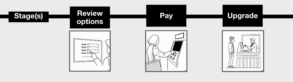
Let’s start with some beige familiar service patterns/common scenarios like choosing a service, paying for something etc. We’re going real beige first, to show you how you can get generic images for your journey stages.
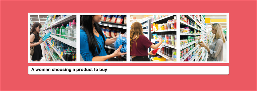
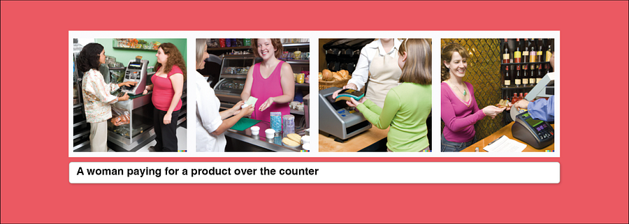
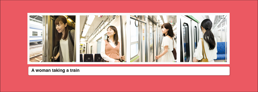
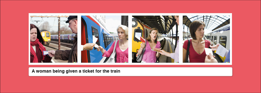
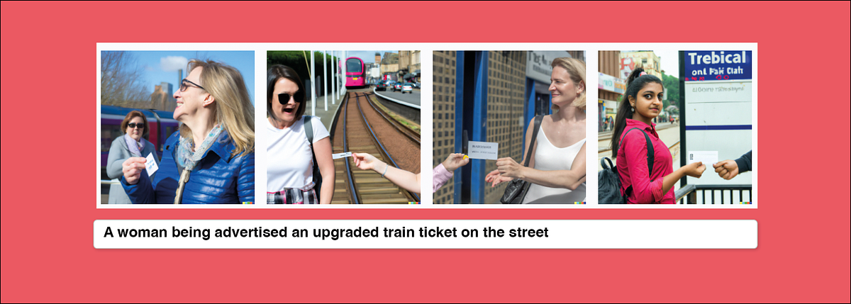
So we see a range of potential service interactions, some are poor due to lack of specifics, some resemble stock footage (like taking the train) and the woman being advertised an upgraded train ticket is plain silly. It doesn’t really work, but it’s a starting point.
Context and channels
The thing I like about this format of generating images using your imagination and language is forcing you to consider the context in which people are using a service and how they are using it.
Context is important (and really only found through thorough user research, you can’t make this up!) to understand where and how someone will use something.
Generating these images should help us to consider barriers, like using it on the go whilst driving, or accessibility needs, like someone using it who has one arm (could be a physical, situational or temporary accessibility need, think someone with a baby in their arm).
We need to think about this in order to design a service fully and test
So let’s take it further…
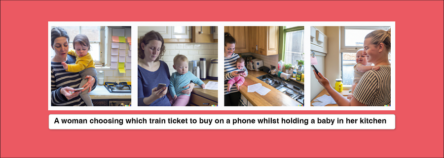
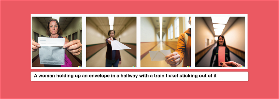
Arguably the image of the woman and baby doesn’t really show us the touchpoint or interaction, we didn’t state it but it’s a helpful way of quickly showing what it might look like in context for someone to use a product or service, and might trigger design/development teams or stakeholders to think differently. Let’s just lol at the woman with the envelope.
To consider how to generate these scenarios you can use these questions;
What part/stage of the service are you trying to show?
Who is using it?
What is the person doing?
Is there a specific service touchpoint in the frame?
Where are they using it?
When are they using it?
What’s in the background?
Who else is there?
Is there any blockers in them using it?
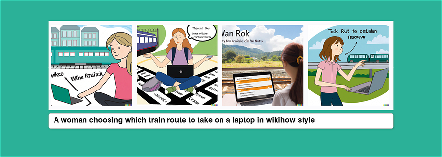
Focus on the touchpoint
Touchpoints, the bits that make up a service (think interfaces, staff interactions, phone calls, physical locations etc) can be helpful to put into the frame.
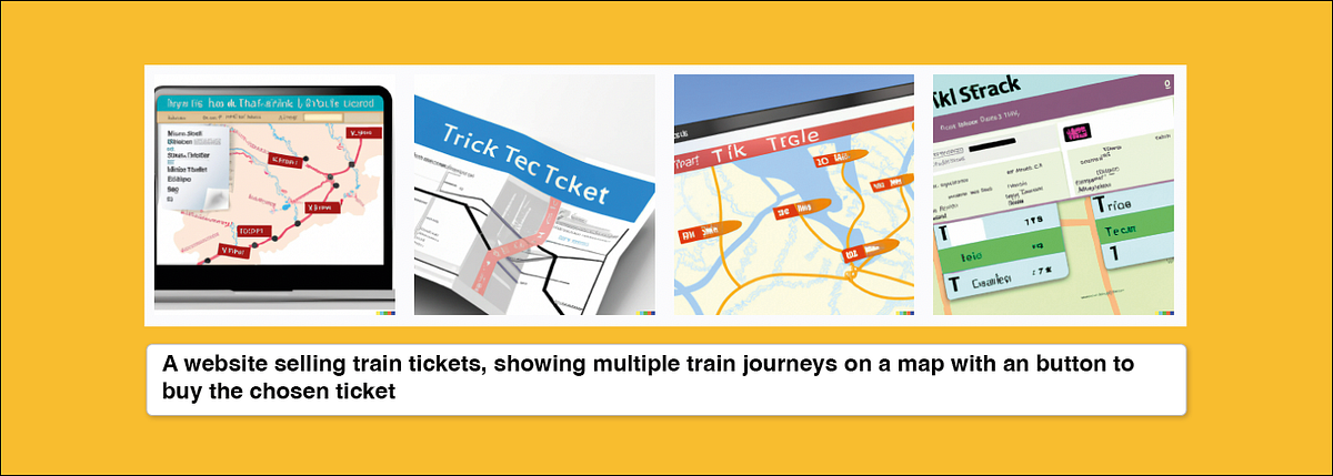
They are a bit more tricky and I’d argue at this level of fidelity (see below) are really not that useful as they’re not telling you anything particular about how your touchpoint helps a user meet their need. However, as a generic image, it might be useful to show in a generic storyboard.
The AI generated image is a representation of what you prompt it,. It is your description as opposed to conceptually developing a design for you so you need to be specific.
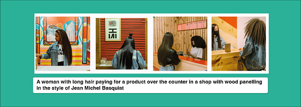
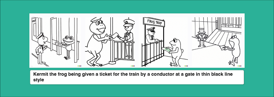
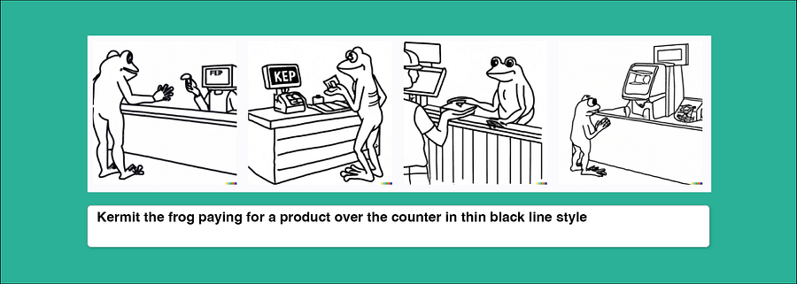
Continuity of style
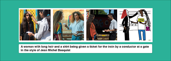
With AI image generators, you can be specific about style. There are lots of ways to do it, let’s take a few prompts to consider continuity and then change the styles up.
You can do things like;
Use a famous artist name, Ask for a 3D render, Ask for a photorealistic scene, Ask for an illustration, Ask for specific illustration style like thin black line drawing or wikihow
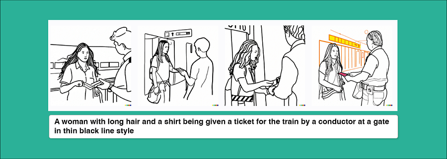
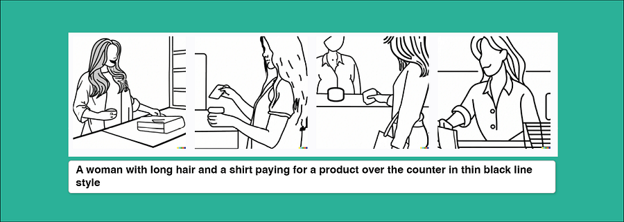
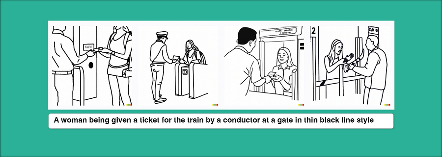
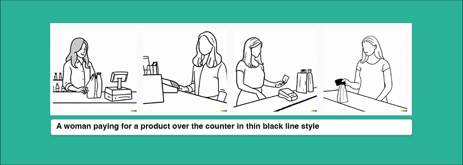
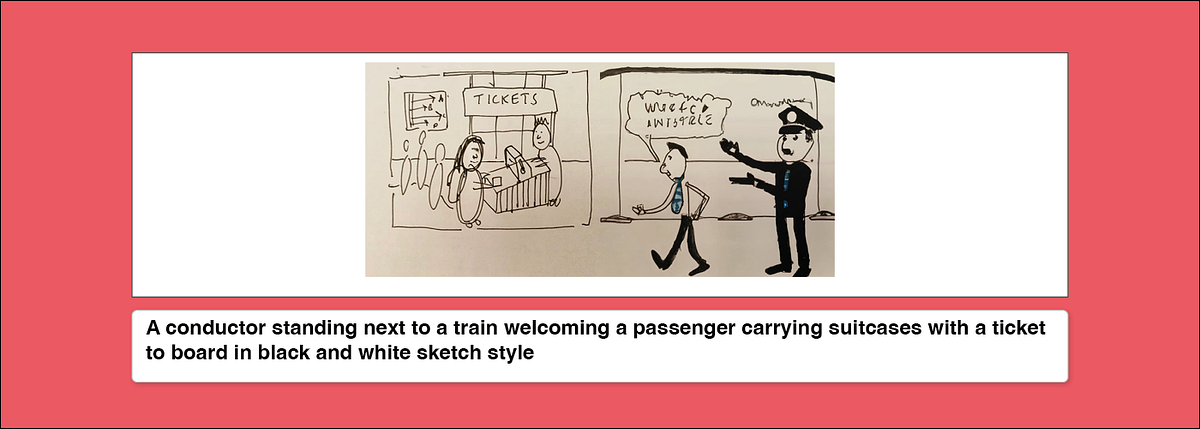
These are nice, black line style works well as a quick way of pulling together a storyboard even if continuity lacks in the characters.
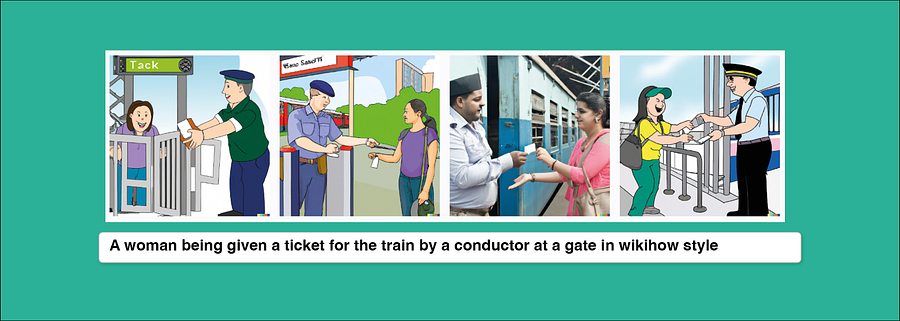
Wikihow is a really interesting style to test out as it does bring a level of detail in terms of idea generation and depth to the scene.
Continuity of character
Now let’s stylise this further. You want to be able to show a continuous character in your journey. Try using someone famous (some AI tools won’t let you use people who are famous) or a non-entity ‘human’ shape for your main character
I couldn’t use famous people on DALL-E so I switched to Midjourney for this.
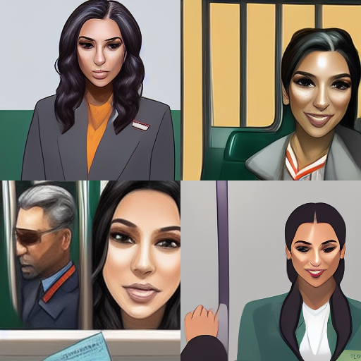
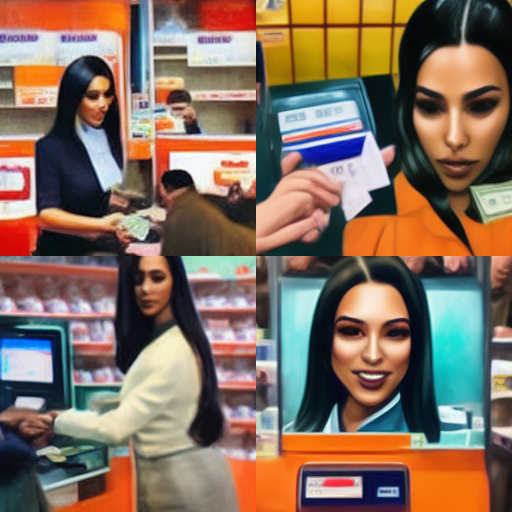
The character works quite well, and you can see at this point I’m adding new prompts in to make it work better for me. Still love that Kim Kardashian is looking glam whilst doing the service admin of everyday life.
Overall as a storyboarding tool, or loose scenario depiction it’s a great, quick way to bring to life the narrative and show someone using your service.
As Tom Norman shared when working in Government and the power of pictures in service design, being visual about how your service works also helps to onboard people to your service team. Finally, as a quick way to bring to life excel spreadsheets of service blueprints, to show stakeholders who have a vested interest in what you’re designing, it’s pretty dope.
I cannot tell you how much time I have spent searching images to make up storyboards from the internet for ‘quick work’.
This is an absolute game changer for moving from descriptions to images.
User Case 2: Design Concepts and Visioning
I’ve lost track of how many conferences I went to that left me uninspired with unimaginative, quasi-sci-fi depictions of the future that really didn’t consider any human or planetary needs. Think smart cities, dashboard of data future visions, some kind of joined up service future that we know can’t exist until ‘standards’ and interoperability truly play out. I’d rather watch Silent Runnings for inspiration than pretend play Jetsons meets service design on steroids.
However, playing with ‘future’ is fun and using these AI image generators can really push us to be descriptive in what we want to see.
Be mindful that what AI image generators give us back, is what’s at the limits of our own human imagination because it’s using and reflecting back the output of our own creativity. When we say ‘future’, our prompts are reflecting back a form of our own futurism, which is limited in scope.
Anyway, it’s sort of cool to see the dirge of our concepts of future.
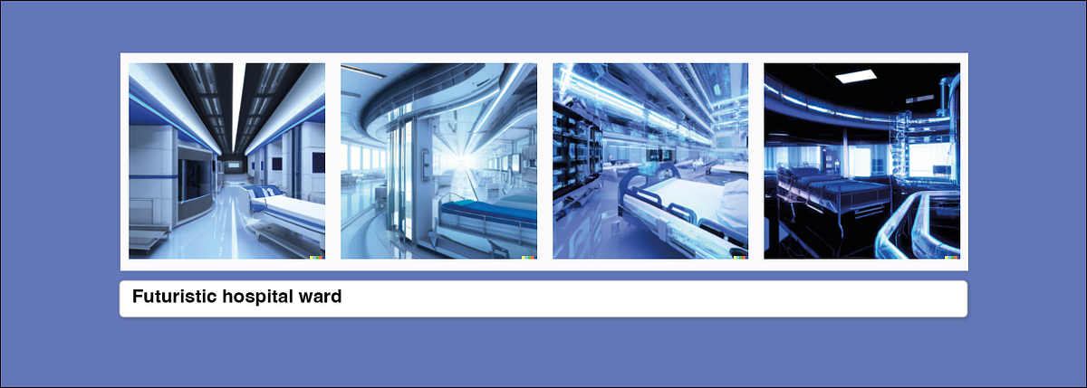
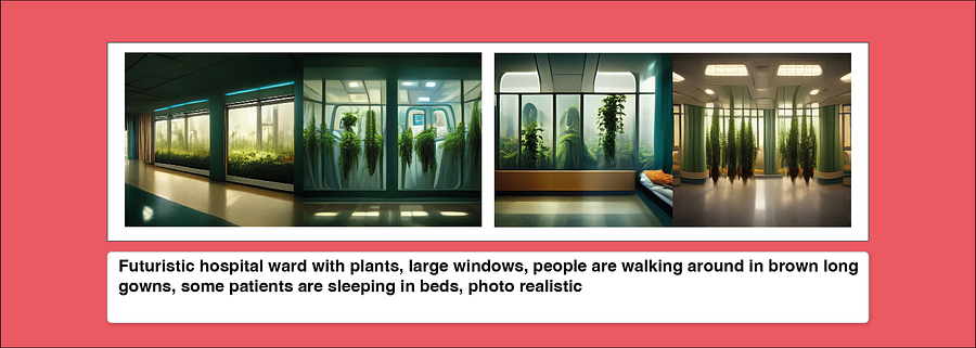
I know I don’t want to go to hospital on a spaceship.
But here’s where it gets truly interesting. These tools goad you into giving it more, into describing what you want to see. You are having to describe the solution.
In my recent observations, despite how silly this might sound given the design profession is supposed to help put down on paper how something might work, the malaise of service design bureaucracy (the constant meeting after meeting after meeting to discuss ‘the design’) has definitely led folks working in this space to be scared to commit and say ‘this is how this thing should work’ and show it. We are constantly deferring responsibility to some ‘other stakeholder’, falling back to research as a deliverable or being noncommittal because of power structures in teams.
Image generators make you commit.
So here’s a quick trial of my ideal hospital (light, plants, very Florence Nightengale principle-esque)
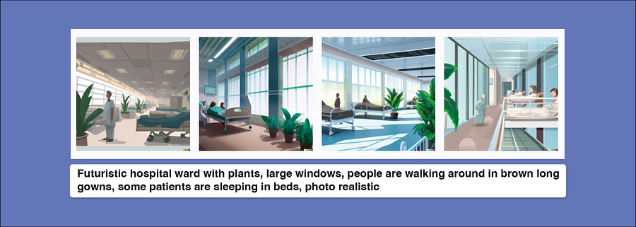
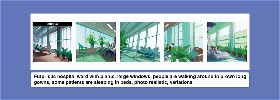
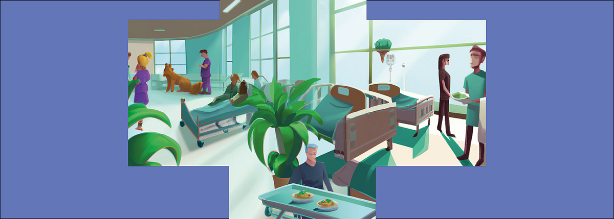
A cool add-on is dragging out scenes with more prompts and building a scene. I think this is another game changer in building imaginative concepts for services. These are not the ‘design’, but they’re brilliant prompts for conversations.
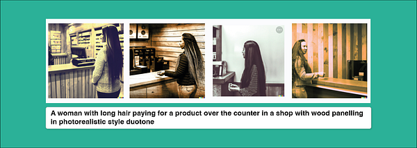
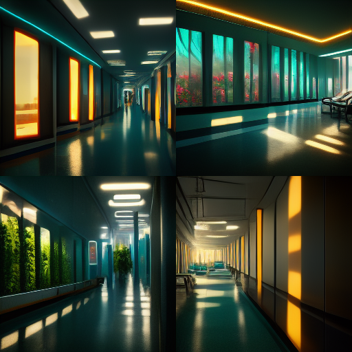
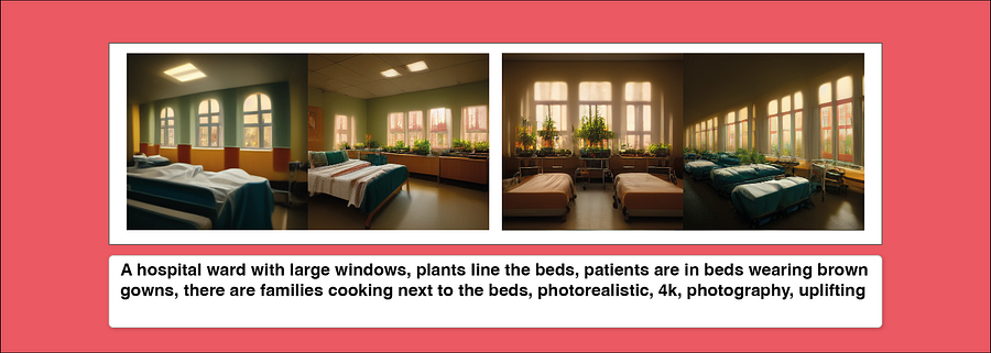
I wanted to try a few other tools and get towards more realistic outputs. I loved using Midjourney and some more photorealistic terms, like 4k, 16k, shot by a photographer etc prompts. It threw up even more interesting and realistic scenes.
User Case 3: Co-design
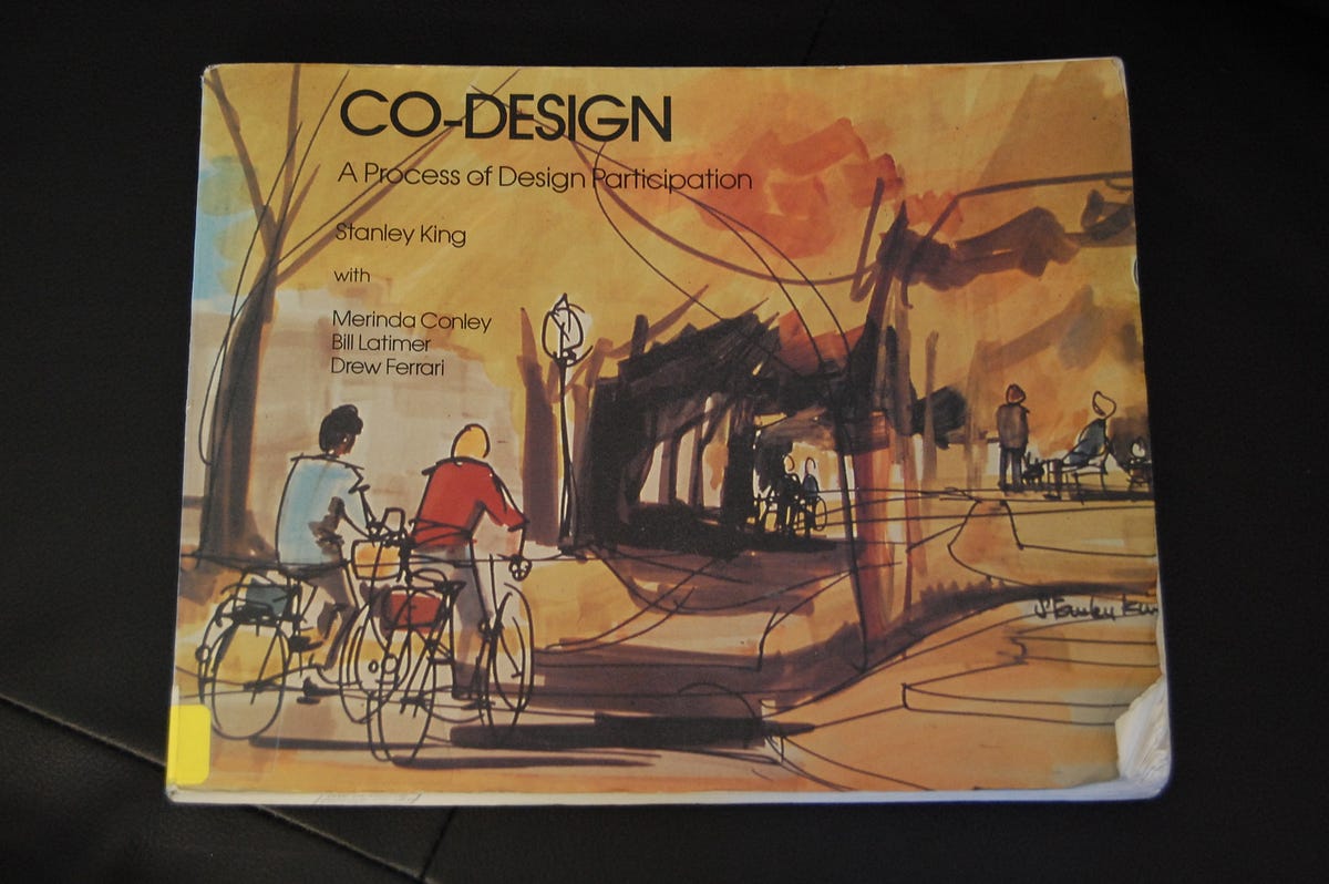
Co-design isn’t a new concept. One of my favourite books on the topic comes from an architectural planning team called the ‘Co-design’ group who originated in Canada during the 1970s, led by Stanley King. They created a book called Co-Design: A process of design participation which walked you through how to give power away when designing new towns, landscapes, and cities.
The book describes their visual co-design approach with communities. They would draw the horizon line and gently sketch in pencil the outlines of fixed entities, perhaps an existing road, or homes or a major sign and would gently take their pencils to putting forms on the paper as citizens described what they’d like to see. They’d then ask them to help them colour it in, and extend the drawing.
The potential for undertaking a similar model using AI image generation with people who are potential service users is exciting. I learned loads from this book and would often use the same methods in co-design workshops, or one to one with people when thinking about services. I’d ask them to describe to me what would help them, what would they like to see, and gently move into more specifics. We’d focus on a ‘scene’ where something is happening and I’d sketch it live in front of them.
I took a prompt from one of my early Snook sketchbooks where I had a man describe to me what a good GP service would look like, here’s what it generated.
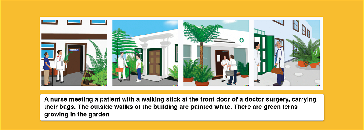
Granted it looks like we’re in Granada somewhere at a private health retreat but why can’t we dream up the aspirational future of what we want to see in our public services? I’ll take this version.
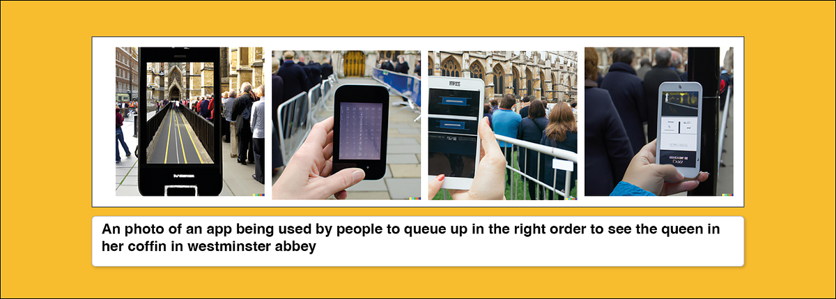
Point is, super quick, 30 seconds, and I had an image. Imagine projecting these out into a workshop, or printing them off live as prompts for research and discussion. They certainly gave me ideas from the random results (see the app in a queue below) — gave me ideas for new functions like ‘fast track’ service on image 1 on left. They’re not designs, they are influences, ideas, random AI thought farts.
Let’s not get carried away
These are my open explorations of some early trials and explorations of where and how this tool might be used. I’ve lots more ideas and some improved prompting to do.
- We still need designers (and researchers!)
We can’t generate visions/futures/designs without doing research on what people need and we need designers to translate these into scalable, usable, familiar designs that can actually be delivered.
Don’t worry, you’re not out of a job, this tool should enhance your work, not replace it. Case in point below. (But watch out for improved image generation, Google’s Parti image generation model showed that once it gets up to 20 billion parameters it can generate text)
2. All sociotechnical systems have systemic biases at the heart of them
I did a talk about this here showing examples of how GP-2 talked about ‘white rights’ and the author of Design Justice, Sasha Costanza-Chock was a victim of an airport scanner system which disproportionally targeted and marginalised QTI/GNC (Queer, trans*, intersex, and/or gender-non-conforming). Folks like the algorithmic justice league and others are doing the hard work to make sure AI is equitable and accountable. What we see when we use tools like this is a mirror of our society that misses out under represented people and communities. I disproportionally still had white people in most of my results and no one was visibly disabled, unless I specified it. It also delivered very Westernised depictions of scenes, and I know you have to be specific about describing what’s happening in a scene, I still felt disturbed by this. Be alert to this, there’s work to do.
3. Always sketch
Sketching for me has always been one of the most quintessential skills a good designer should have, being able to visualise in the moment a conversation on requirements, functions or loose concepts being discussed is gold dust. I’ve always thought that ability to translate words into visions on paper was a superpower. These tools are not a summons to stop drawing. Quite the opposite, they’re here to inspire you, make you think, draw out decisions.
They shouldn’t replace a designer*
*Not yet anyway… (although they did expertly extend my own sketch on the left)
School of Good Services
I’m a director at School of Good Services and I train people on service design, getting buy-in from stakeholders and building business cases for design.
We’re thinking about putting a short course together that delves into image generation for service designers, different uses, helpful prompts if there is demand. If you’re interested, drop us a line on our contact form and we’ll think about it!
If you want to get into Service Design, I’m running my next public course from 3rd — 17th November every Thursday. All our training dates are here and we run private courses for organisations.