I’m publishing these excerpts of talks I’ve given so they’re accessible to people I share design introductions with.
They cover some basic principles, key moments in the history of design and the value of user-centred design for organisations.
It’s only a few of my favourite examples and narratives of explaining how consciously designing to meet user needs came from.
Design isn’t always universally understood.
The first time we went to the bank to set up Snook in 2009, back in our humble setting of Glasgow, we were asked what we do.
I’m a designer.
Do you design clothes?
No…
Chairs?
No…
Websites?
Sort of…
What is it you design?
Services. I’m a service designer.
This is the usual conversation I have because when most people think about design, they think about physical objects. You often think about iconic physical products like Apple phones or Dyson Hoovers, and if you’re into it, some Dior Haute Couture. Many of us rarely consider that a service we use has been designed.
Good services are mostly invisible, meaning they work for the user first time and we don’t think about the layers of technological development, content, UI and process design that’s gone into them. When they don’t work they are memorable, but services that don’t work have rarely been designed to consider how a user will experience them.
Think about when you’ve received a letter from a council and you can’t work out how much you’ll pay in council tax for the year. Or scrambled on the phone whilst your bank asks you to read a reference code you can’t find on the letter they sent you. Or when you can’t book a GP appointment for when you need it. Or when a hotel keeps you waiting at the reception desk for over 15 minutes to check in. Or when someone you love passes away and the council continues to send you letters in their name. We use countless services every day, from the trivial to the critical, the emotional to the practical. When they’re not designed for our needs, they fail us.
And the cost of failure is high. U.S. companies lose more than $62 billion annually due to poor customer service. It’s anywhere from 5 to 25 times more expensive to acquire a new customer than it is to keep a current one. And when our services fail in critical domains, people die. Services will always fail, but it’s how we design what happens when it does, and our resilience to deal with it that matters.
In the UK context, the cost of delivering services is high. One-third of UK GDP is spent on public services. 80% of the cost of Government is spent on services, 60% of that cost is spent on calls and casework and 40% of the calls to the Government are asking ‘how do I…?’ and ‘where is my thing?’. Apart from retaining and winning great customer reviews, there are significant savings to be made by redesigning services to deliver value more efficiently, and often this means by meeting the user need first time.
The point is, most services were never designed, they just sort of happened. With the advent of the digital age, we invented new channels for users to interact on but we rarely took a step back to look at how the end to end journey works for people, navigating their way through letters, phone calls, online interactions. And that’s just the front end of the service.
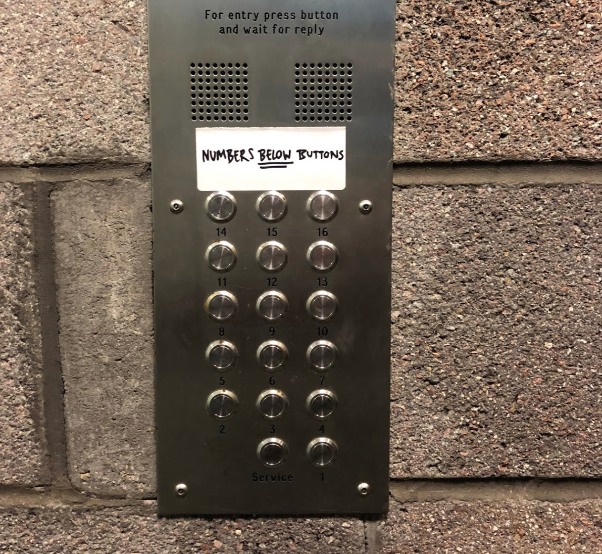
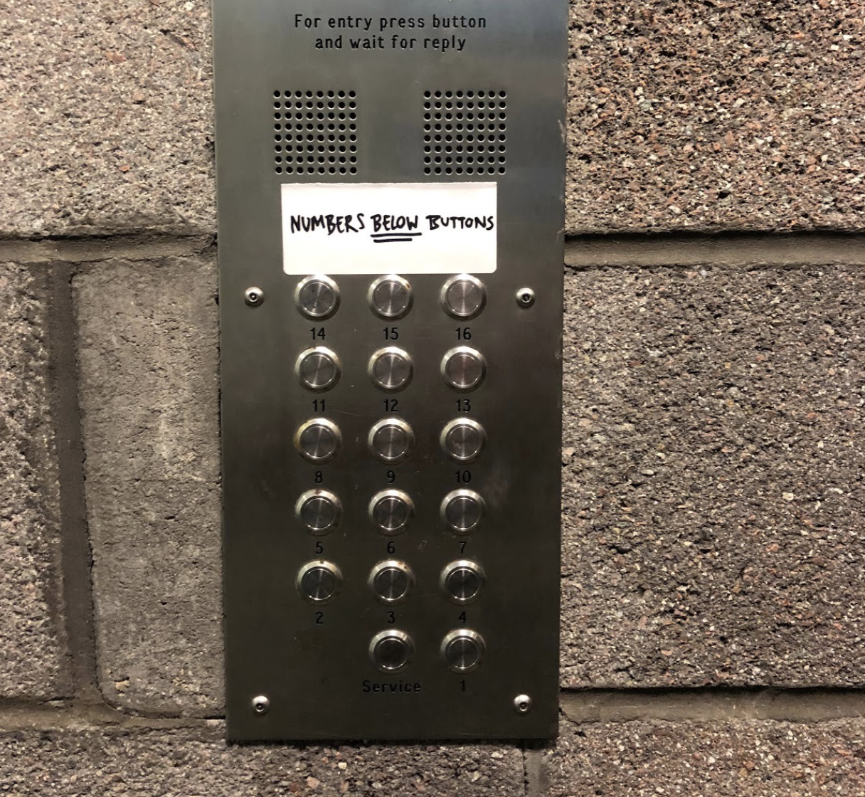
You see much of the world is a form of unconscious design. Unconscious design is like my step dad’s buzzer system. The picture says it all. Untested, unthought through, some poor soul has had to tell people to stop buzzing the wrong door. I have forever been pressing number 5 when it should be 8 for over fifteen years.
When it’s conscious, it’s great. Take the Japanese bullet train, for example, you can see the purposeful markings on the ground that direct you to stand at a certain point and wait for the train. And what do you know? The train will stop with the carriage number you are due to be seated in. That is a conscious design — it is guiding your behaviour in the built environment to do something that works for you.
An evolution of design into forms follows function
We can look back at the evolution of design through lots of different lenses and narratives, and I typically use my background, which is product design, to explain some of the ideas behind it. Where we are today — which is a heavily promoted industry — was completely different over 200 years ago, where making and manufacturing were one person’s job.
Let’s go back briefly to consider where some of the principles of user-centered design may have come from and how it evolved. This is a massively chequered history and I’ve omitted huge bits (that would be a whole book) but it will give you a grasp of early thinking and historical events.
Before production lines there were artisans creating products entirely by hand. They were responsible for the shape of a vase, the colour, the pattern on it, the lip, the handle. They made the design decisions because they were the ones making the whole thing. As the neo-classical style became more popular, the demand for homewares rose. Josiah Wedgewood, an English potter and an entrepreneur, had a cunning idea to break down the manufacturing line, asking individuals to look after one part of the process and develop patterns that would help scale consistent designs (a bit like the GDS Design system today). You can see this at scale when Henry Ford invented the Ford T-Model and the concept of Fordism emerged.
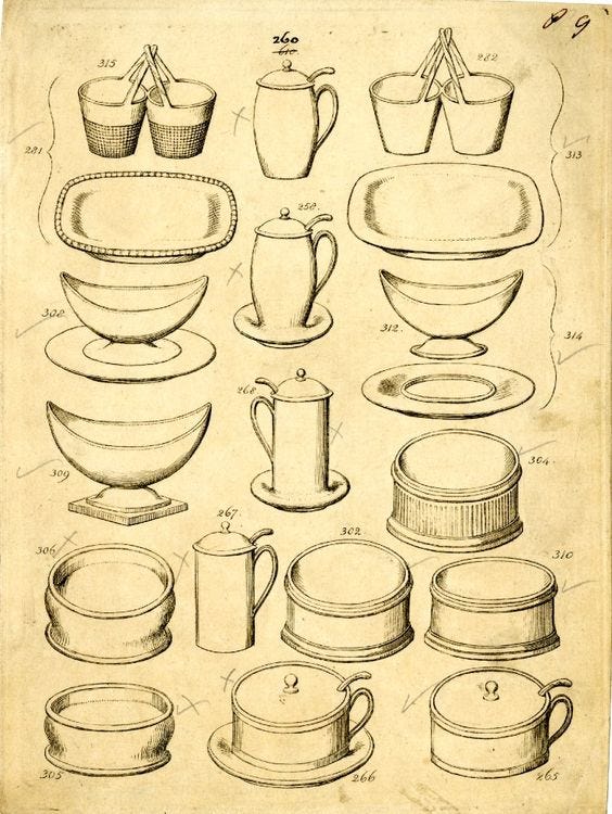
This was a key moment. As the industrial revolution evolved, we moved from a pre-industrial design age which was craft orientated to an industrialised design age based on scientific knowledge and mass production. The industrial revolution fundamentally shifted technology and the products in our hands. It also dramatically shifted the way we work, co-create, and built things.
As British writer John Hesket said;
“The originators of the ‘design methods movement’ also realised that there had been a change from the craftwork of preindustrial design to the mechanisation of industrial design”
Design’s key characteristic was that it became separated from manufacture: no longer did an artisan make the design decisions, we consciously made design decisions upfront before they were manufactured and used by the public.
Emerging in this industrial revolution, due to new materials and manufacturing processes was modernism and some of the very early thinking of user centered design. The famous Wainwright building was designed by Dankmar Adler and Louis Sullivan and built between 1890 and 1891 and an early example of modern design rising at this age. The building is wildly different from the architecture of the day, and considered the first expression of high rise as a tall building, which we have come to know as skyscrapers today.

New technology and materials provided opportunity for something different and he was determined not to design something from an old pattern book. ‘From within outward’ was the concept that Sullivan’s design would take. That the internal function should describe the outward appearance. With a small bit of land (it was expensive) he needed to build upwards. With the needs for commercial office space, he created 100s of compartments, all the same in a honeycomb model. With the increase in need for commercial units, he built huge towering windows and expansive ground floor space for shops. The maxim, ‘Form Follows Function’ as opposed to ‘form follows precedent’ was born here. The building looked the way it was intended to be used.
In the following years, these modernist principles can be seen in publications like ‘Ornamentation is crime’ from Adolf Loos in the early 20th century criticising additions to buildings that, in his opinion, did not need them. We see the modernist principles rising in the likes of the Viennese architectural scene. They focused on new modernist forms and materials by the likes of Otto Wagner who designed the classy Austrian Postal Savings Bank and Karlsplatz Stadtbahn Station.
If you’re still puzzled about the difference between, say, neoclassicism and ornamental style architecture/design and modernism contrast Frank Lloyd Wright with Liberace.
Form follows function is not solely down to Sullivan alone. Philosophers, designers, architects and engineers of the time were producing publications that aligned with this thinking; that beauty results from purity of function. We soon started to see this in design disciplines beyond architecture.
Form follows function beyond architecture
There are lots of examples of this maxim taking hold across design in the 20th century.
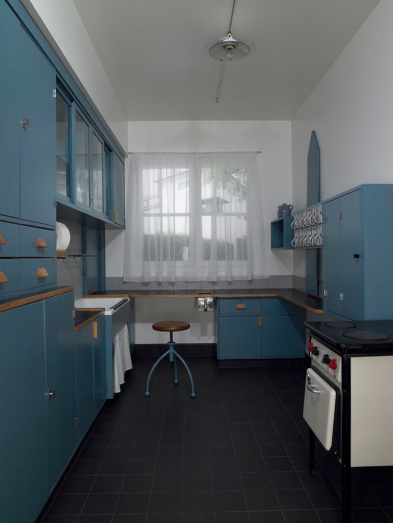
In the 1920s, 10,000 units of Austrian designer, Margarete “Grete” Schütte-Lihotzky’s Frankfurt kitchen were installed in Germany. It was a milestone in domestic architecture and interior design and is considered to be the forerunner of modern kitchens. Not only was it compact, to fit the size of the dominant social housing of the time. It was also low cost to manufacture and designed for maximum efficiency. If you look at the design, you can essentially move around the kitchen from gathering the food, chopping it, disposing of waste, cooking it and then eating it in one journey. There are feminist critiques you can read on this and various design flaws, but we see here an early exemplar of form following function in industrial design forms. It’s important to note, Lihotzky saw her design as making housework easier and considered it a form of emancipation for women. (Note: design is rarely a solo celebration and Lihotzky’s design builds on the shoulders of other women, including Catharine Beecher and Christine Frederick who built model kitchens which introduced standing height surfaces and compartmentalisation concepts as early as 1843. Beecher’s book ‘A Treatise on Domestic Economy For the Use of Young Ladies at Home and at School’ laid out kitchen plans and built-in Taylorism practices.)
Another great example following this motto includes the classic road sign. The font ‘Transport’ which many of us see every day, but fail to notice was designed by Margaret Calvert in partnership with Jock Kinneir. Road signs are, as Wired described, intuitively invisible. They are not there to be noticed or stylish, they are there to allow us to navigate without having to think.
On designing the signs, Margaret said;
“Style never came into it. We were driving toward the absolute essence. We were reducing the appearance to make the maximum sense at minimum cost”
Margaret Calvert and Jock Kinnear, 1961
And the process of ensuring the signs worked was by producing prototypes and testing these in an airfield. The picture above shows volunteer airmen in 1958 from Benton airport in Oxfordshire in the middle of the airfield, while a car drove towards them with alternate combinations of the signs (and different fonts) mounted on the roof. Here we see the very essence of this motto and the other tenets of design being enacted. Prototyping and iterating, which is testing before implementation.
Coming more up to date, movements in Scandinavia in the 1960s in Co-operative Design laid many foundations for many of the terms we use today around user research, interaction design, HCI design and service design. The historical basis for much of it was the discussion about the relationship between work and democratic values in Scandinavia around 1960.
I’ve always respected the Scandinavians and Nordic geographies for having an amazing human-centred cognitive operating system, and it made sense that the approach to designing new interactions would come with people at the heart of them.
Key individuals in this movement include Kristian Nyaagard who led projects with the Norwegian Iron and Metal Workers Union (NJMF) in the early 70s. The objective was to apply a workers’ perspective in the development and introduction of new technology in order to produce an action plan that would represent and strengthen the workers’ position when introducing computer technology. Nyaagard made a move from traditional research and development of computer systems to working directly with people in designing the computer systems they would use, testing their interactions and asking them for feedback. This might seem commonplace now, but back then, this was pioneering.
That’s only a few examples of moments in history where we’ve seen the principles we’ve become so used to referring to as user-centred design come into being.
The motto, form follows function, has continued to be referenced right up to now. That design is about making things usable and useful over how they look. That beauty is derived from the functionality of meeting people’s needs.
And that is design. It’s not the bit at the end, it’s embedded right at the start, in the defining and designing of what the thing does, how it meets people’s needs and easily, and so intuitively that, in many cases, the design is completely invisible.
My final example is the one I love to chuckle about the most and share with people when I’m explaining good design.
In 2014, Government Digital Service won the Design of the Year award. This is a seriously coveted award in design circles and they beat the Olympic Cauldron for their website Gov.uk. At the time, the press (the Daily Mail) covered the story naming it boring.com.
In its general aesthetic it’s a seemingly simple black and white website — and possibly boring to some — but it helps you use Government services easily. Essential things like replacing a lost passport, finding out how to claim benefits and processing payments.
It’s been designed by designers of all kinds. From service to content, graphic to interaction. Technologists and developers. They have all played a hand in taking services like ‘renew my passport’ and made it as easy as possible for you to do.
You see, before it was built, users had to be experts of the services. Think about applying for a new passport. You had to find the right page, navigate the heavy content, download a PDF, fill the form in, scan it, post it, phone the appropriate public body for more help and probably call them again to find out if their submission was being processed.
Now, you can go to Google — essentially the home page to services — and type in ‘I’ve lost my passport’. Within milliseconds you’re applying for a new passport on Gov.UK. This service has been designed to meet your needs. Even the content and the SEO (how Google responds to your requests) has been designed, knowing that most people who type ‘I’ve lost my passport’ will need to replace if they’re in a UK location.
These Government services are being designed with people who use them. Researchers, designers and policymakers are spending time in the lives of service users, analysing their needs, testing designs before they’re launched. It results in services which are easier and cheaper to deliver. And they’re designing everything. From the content you read, to how you navigate the page. Alternative ways to access it offline, to how fast the page loads on your screen. All of this has been consciously designed.
And the claimed savings are remarkable. In 2014–2017 it was estimated that the Government had saved £3.2 billion by making their services more ‘user-centred’ through the first transformed services of Gov.UK.
Form follows function needs literacy in design and masters
If we are to deliver great services we must invest in designing them. Service Design is about ensuring the capabilities of the organisation and what they deliver matches up with what the user needs to do. Think about a theatre. The front stage, what the audience experiences, is being orchestrated by staff behind the scenes. Moving the set, pointing the lighting, pulling up the curtains and experienced actors working to a script. Our job as service designers is to make sure all of the front stage — what the user experiences, and the backstage — what the organisation delivers, link up.
We can’t design great services if we don’t recognise that everyone is responsible in some way for considering the user experience. Whether you work in finance, policy or IT, your decisions have an impact on it. That means, we must all have a basic set of skills and literacy in understanding what good looks like and how we can orchestrate what we deliver together better, to meet needs. Form follows function is a motto we can use, and the tenets of design like testing services and considering user needs are parts of what we need to do.
Equally, we need skilled people to care about the detail too. That means hiring designers to work on your projects and in your organisation. We need design literacy and design masters.
The maxim Form follows function isn’t an afterthought. It is the central principle.
If we want things to be designed well, design must be embedded from the start.
This is from a series of talks I’ve given introducing design. It’s important we look back in history and analyse the stories of where design has evolved.
Some of these thoughts can be found here, which is a collection of stories, narratives and one-liners I use in design education.
